
INSIGHT
Stop being so polite!
Why safe design might be the most expensive mistake you can make
We’ve moved on from the corporate, carpeted grey interiors of the 2000s. But have we simply replaced one formula for blandness with another? Walk into a contemporary hospitality or retail space and there’s a good chance you’ll encounter some familiar ingredients. Natural stone. Reclaimed timber. A sculptural statement piece. Soft lighting. Curved furniture. A restrained palette of beige, cream and maybe some muted greens. Perhaps something locally made, carefully positioned to communicate authenticity.
Individually, these are all good design decisions. The problem comes when everyone starts using the same formula to achieve the idea of what a beautiful, authentic space should look like.
The social media feed has played its part, giving instant access to an endless stream of reference imagery. Now AI can generate almost any version of a 'beautiful space' in seconds and because these systems learn from what already exists, familiar visual conventions can become even more deeply embedded. The danger isn't that AI will make design ugly, in fact, it’s quite the opposite. Without any deeper thinking or imagination - it makes it too familiar, serving up a beautiful, polished version of everything that has already been done.
Designing beyond the visual
This is where the idea of multi-sensory design becomes interesting. Recent research from Gensler argues that environments create greater emotional impact when they engage more than just our eyes. Its findings highlight three areas: the emotional impact of multi-sensory environments; the importance of coherence between different sensory elements in creating memorable spaces; and the role of inclusive multi-sensory design in giving people greater choice, autonomy and emotional safety.
Some of the most memorable hospitality experiences understand this instinctively. At Alchemist in Copenhagen, diners enter a vast planetarium-like dome where projection mapping and reactive soundscapes transform the environment throughout the meal. The experience moves from an ominous underwater world to a vibrant forest, with sound and imagery changing alongside the courses. At The Fat Duck in Bray, the famous Sound of the Sea dish goes even further. A conch shell conceals an iPod playing crashing waves and seagulls as diners eat the seafood. The sound isn't just decoration. It changes the context in which the food is experienced.
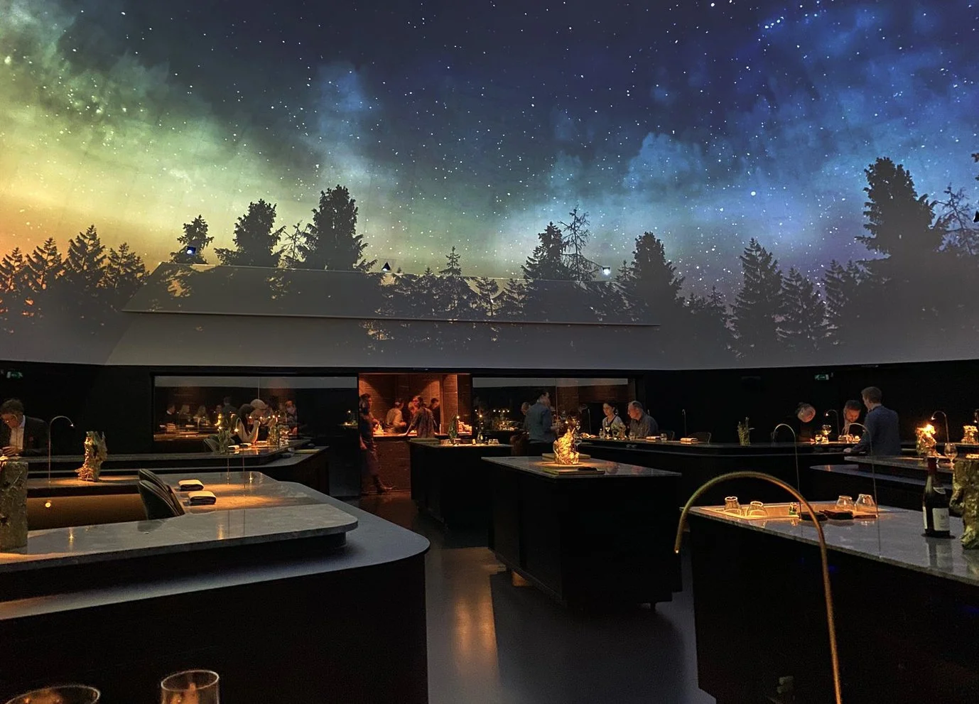
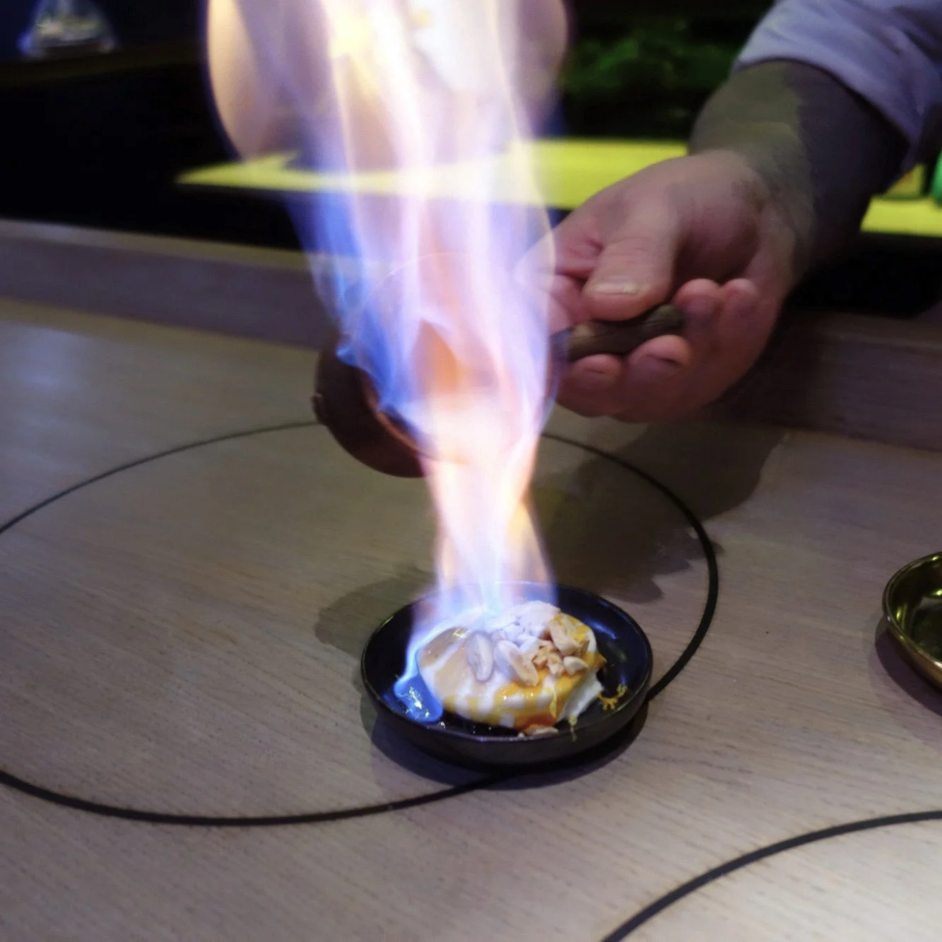
Alchemist in Copenhagen
These are of course extreme examples, but the principle doesn't have to be. Multi-sensory design can be much quieter. A rough stone counter beside smooth glass. The warmth of timber against cool metal. A change in texture underfoot. The acoustics of a space carefully considered alongside its lighting. A particular material or scent that becomes associated with a brand. The aim isn't to throw every possible sensory stimulus into a space. When all sensory inputs align seamlessly, the space stops feeling like a curated aesthetic checklist and begins to feel like a living, breathing reality.
Breaking the formula
The pressure to conform isn't just coming from design trends. It's also coming from the way brands now compete for attention. As more and more of our brand discovery happens through algorithms, there is an incentive to create content that performs rather than ideas that endure. The more a particular visual language gets rewarded, the more brands replicate it and the harder it becomes to stand apart.
As strategy executive Ana Andjelic puts it in the Vogue article, How Rage Bait Became all the Rage:
“You need to create more and more extreme things in order to be picked up by the algorithm. Brands are content factories and the algorithm is teaching them what to put online.”
She describes the resulting attention economy rather neatly: “Attention is like fast food, it's all empty calories that leaves you hungry.”
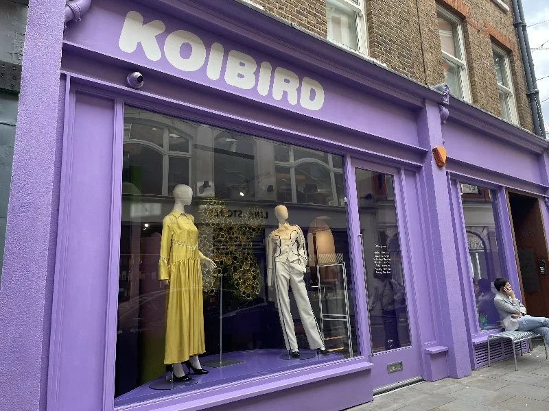
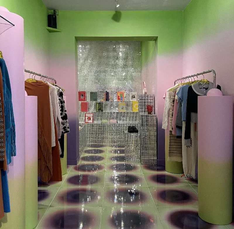
Koibird in Marylebone, London
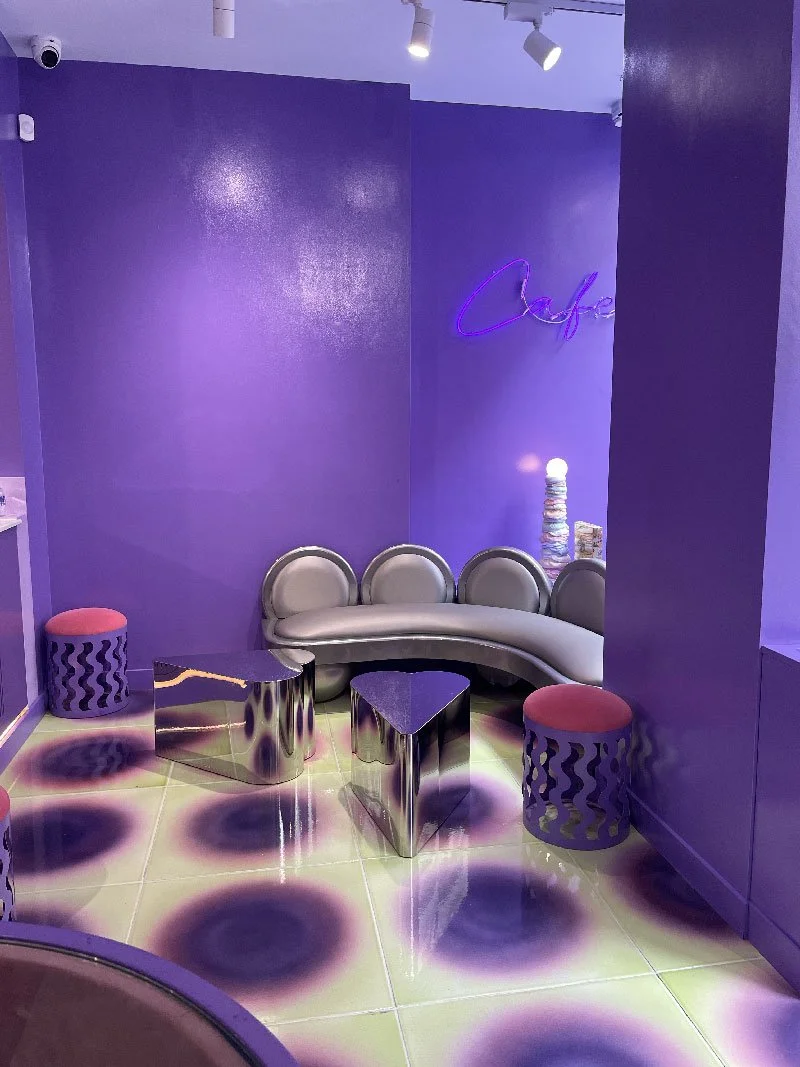
Koibird, the Marylebone boutique founded by Belma Gaudio, has taken a more radical approach: it has moved offline entirely. Rather than allowing online algorithms to dictate what it buys, presents and promotes, the store has deliberately made discovery its proposition. Gaudio describes the motivation as creating the opposite of the increasingly homogeneous online shopping experience. Without trying to satisfy an algorithm, she says, the buyers can take bigger risks, choosing things because they genuinely love them, because they are beautifully made, because they make people laugh or because they introduce customers to a new designer.
It's a useful reminder that differentiation doesn't always come from doing something more extreme. Sometimes it comes from stepping outside the system that is making everything look the same.
We've taken a similar, but more subtle approach with our new design for Astley Clarke, using contrast rather than conformity. Deep brand blue sits against lighter pink slate textures; curved sculptural forms contrast with the timeless practicality of glass display counters. The contrasts create visual tension. But they're also tactile. You can see the difference in surfaces. You can move around the curves. The hard, cool precision of the glass is balanced by the more natural character of the stone.
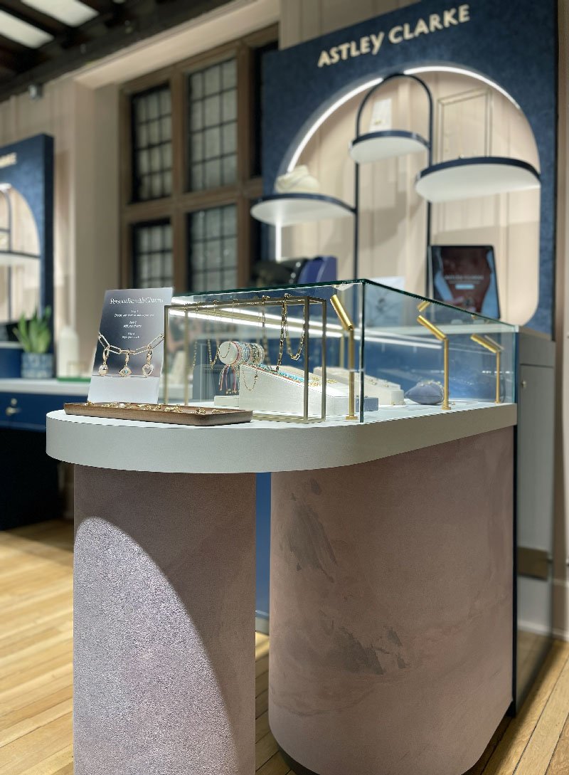
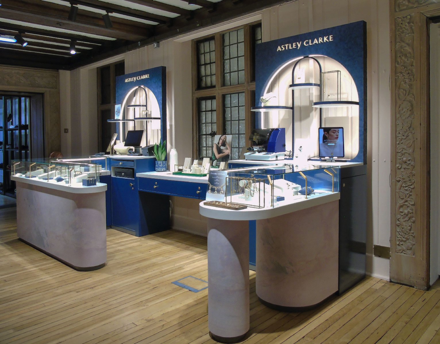
Astley Clarke in Liberty
Personality is a sensory experience too
There is another ingredient that doesn't appear on a standard design checklist: personality. Wit, humour and a sense of self-awareness can be just as powerful as colour, texture or sound when it comes to creating an emotional response.
We're seeing it increasingly in cultural events, fashion and hospitality. At a recent event, Margaret Qualley arrived in a pair of barefoot sandals, that instantly divided the internet. It wasn't about being conventionally beautiful. It was about having a point of view.
The same principle is at the heart of Koibird’s decision to move away from online retail. It’s about creating an environment where discovery, humour and personal taste can exist outside the constraints of an algorithm. That is personality. And personality is difficult to replicate.
In hospitality, it might mean an unexpected detail that makes a guest smile. At Monty's, we built personality into the space through playful graphics and phrases such as “Cut the mustard”, “In a pickle”, “Know your onions” and “Never eat more than you can lift” small moments of wit that reinforce the brand and give customers something to notice and remember.
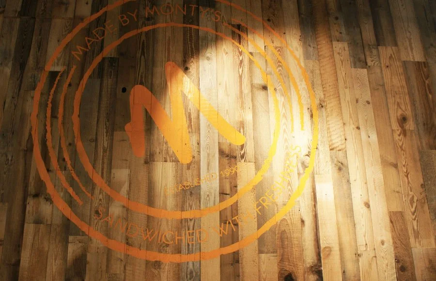
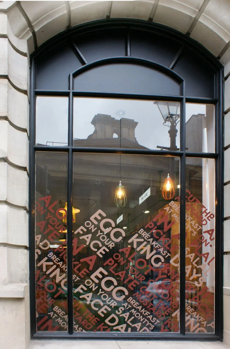
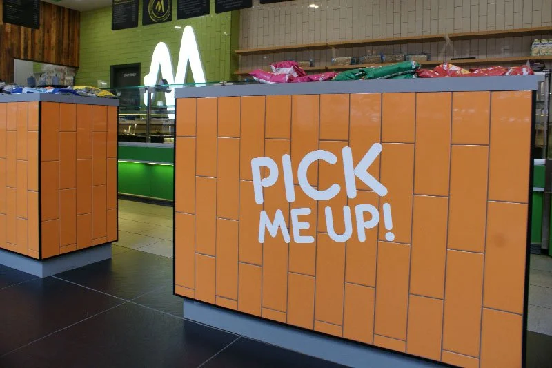
Monty’s Deli
These moments work because they interrupt expectation. When everything else is carefully curated, polished and considered, a little wit can make a space feel human. It transforms the environment from a backdrop into something with a character of its own. And importantly, it doesn't need to become gimmicky. The best examples feel intrinsic to the brand rather than added for an Instagram moment.
A feast for all the senses
Food and drink already provide some of the richest multi-sensory experiences we encounter. Think about walking into a bakery: the smell of bread, the warmth of the oven, the sound of trays moving, the texture of packaging, the visual display of the products. At Kanteeny, the freshness and colour of Mediterranean food are echoed through our design of the branding and interiors, creating a sense of consistency between what you see and what you eat.

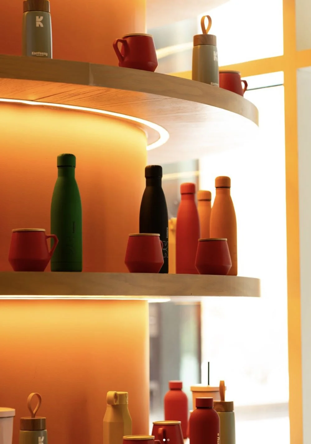
Kanteeny cafe, interiors & branding by Caulder Moore
The most effective multi-sensory design isn't necessarily spectacular. It might be the acoustics where you can hear your companion talk that make a busy restaurant feel comfortable, a material that makes you want to run your hand along a counter or expressive lighting that changes the atmosphere from morning coffee to evening drinks.
Beyond the formula
Perhaps the real problem isn't the checklist. It's playing it safe. When brands are surrounded by endless references, algorithms rewarding what already works, the temptation is to make decisions that nobody can object to.
But if nobody can object to it, will anyone remember it?
The brands that cut through aren't necessarily the ones with the biggest budgets or the most spectacular spaces. They're the ones prepared to have a point of view. To use colour when beige would be safer. To introduce humour where sophistication is expected. To create a little tension rather than smoothing everything out. To make a choice that might not appeal to everyone, but will mean something to the people it does appeal to.
Safe design might offend no one. But it rarely gets anyone talking either. Your brand doesn't need to be louder. It needs to be more itself.
And perhaps that's the real antidote to the formula: stop asking for merely a beautiful space and start asking for an experience that only your brand could fulfil.